The horizontal logo is the primary logo and should be used in most instances.
Our identity represents our organization’s commitment and purpose.
By applying it consistently, we will increase awareness and strengthen our image.
In body copy, typeset IDB Invest in the same typeface used in the text, and in all caps except for the letters 'nvest'.
Logo

The IDB Invest logo must perform well in all sizes.
Use the guidelines below for the correct implementation of the small logos. Small logos must remain legible.
Logo
Size

Print, 25 mm wide

Web, 100 pixels wide
Color Variations
The primary logo is preferred and should be applied in all contexts, except for applications that lack sufficient contrast or reproduction capability.
The 80% solid black logo should only be used on white backgrounds or in contrast with bright colors.
The gray logo can be used on neutral shades of color where there is sufficient contrast between the logo and background.


Clear Space
Do not encroach on the clear space around the logo, equivalent to the width of the 'B'.

Clear Space with Partners
Follow the spacing and alignment specifications below when using the IDB Invest logo alongside the IDB and IDB Lab logos.
Always maintain the clear space guidelines, keeping partner logos at a distance greater than or equal to the height of the globe (x).

Don´t encroach on the clear space around the logo, equivalent to the width of the B
Logo
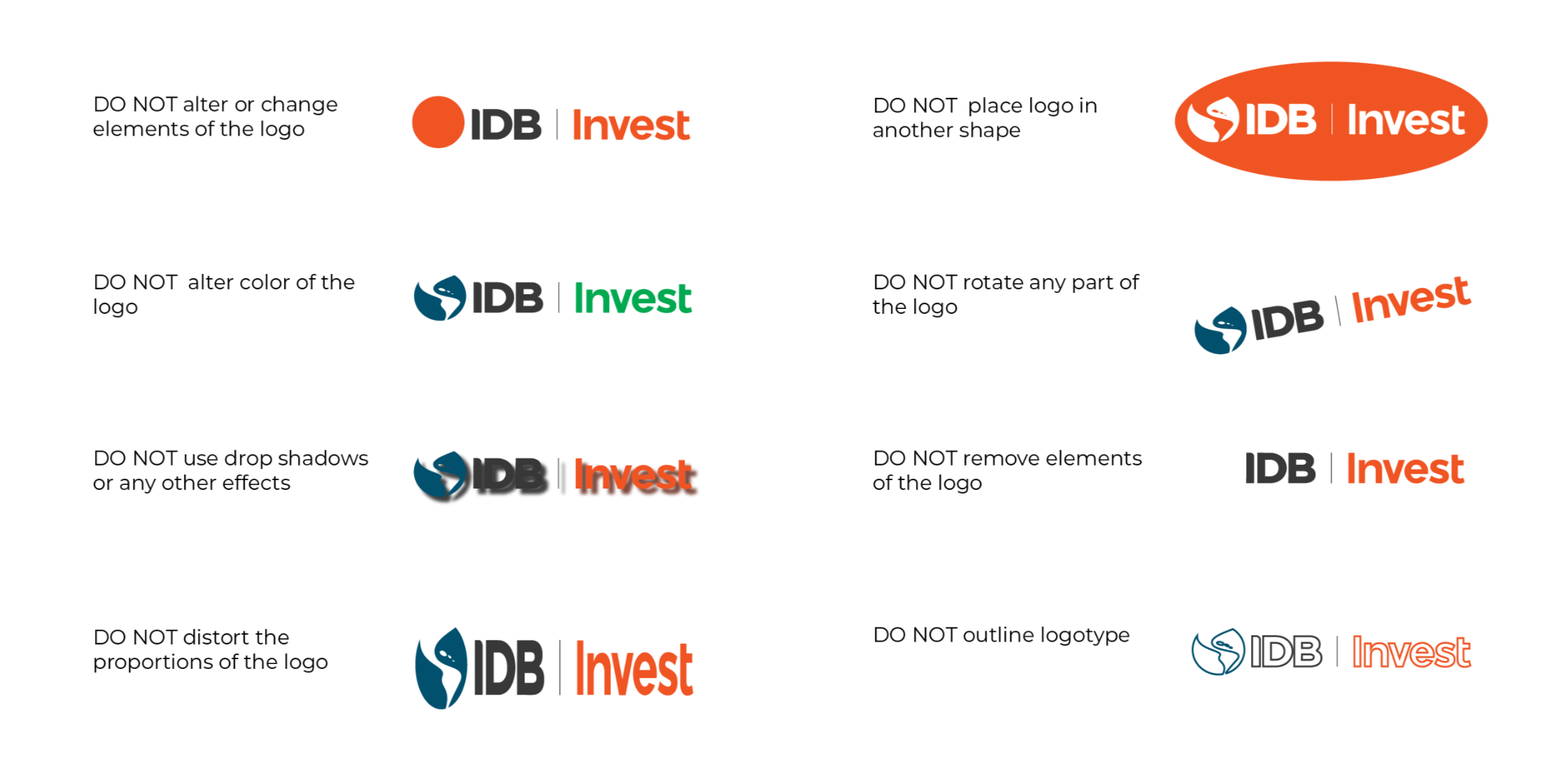
Misuse

Color
Our color palette must always be bright, positive, and bold.
Primary
Color
Embrace ORANGE as the most important color of our brand. It provides distinction from other brands, especially within MDBs.
Orange is our primary color. It is a statement, it is meant to be bold and bright, and it is a color that reflects positivity and hope.

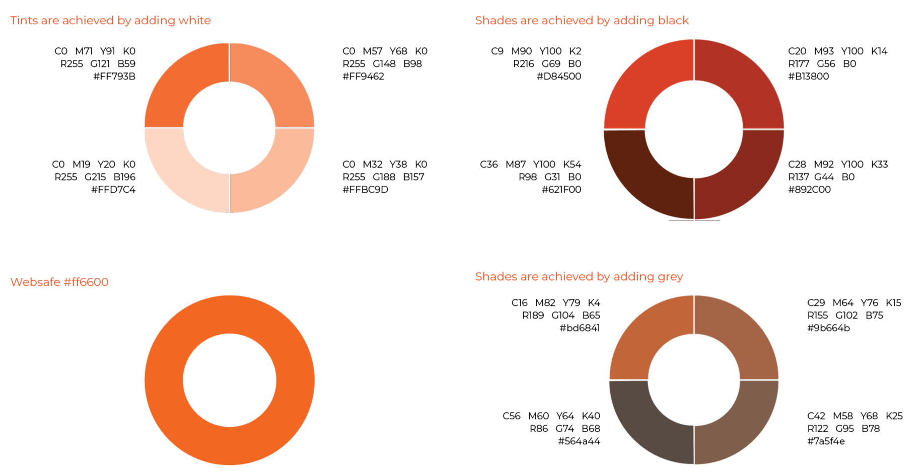
Tints, Shades & Tones
Secondary
Color
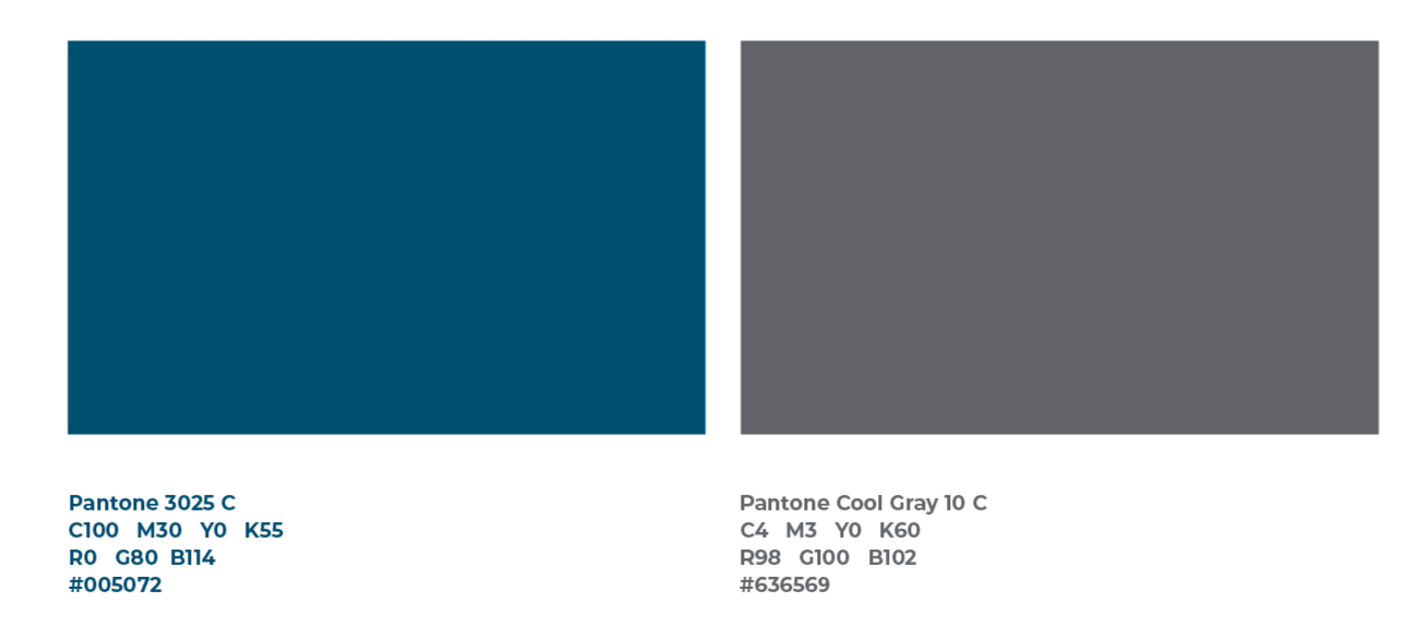
Tints, Shades & Tones


TertiaryColor

Tints, Shades & Tones


Color
Percentages


Typography
Primary
Font
We use our font, Inter, for everything branded and marketing—from banner ads to publications. It was designed to be incredibly versatile, with lots of range in terms of tone and playfulness. It can be quirky and expressive when it needs to be, or neutral when the situation calls for something a bit more serious.
If you are not part of the Communications Team, you don't have to use this font.
For all other teams please see below.
Inter
A B C D E F G H I J K L M N O P Q R S T U V W X Y Z
0 1 2 3 4 5 6 7 8 9
Day-to-day
Font
When working with Microsoft software, please use Aptos as your primary font family. You may use it as an optional font to highlight words or phrases.


This font family is preset in every computer with Microsoft software, so sharing your documents outside the institution will be problem-free.
Icons
Our icons combine geometric shapes and lines to visually represent core sectors.
While each sector is distinctly different, all icons are unified through color and simple form.
DO NOT create any additional icons based on the style of our sector iconography.
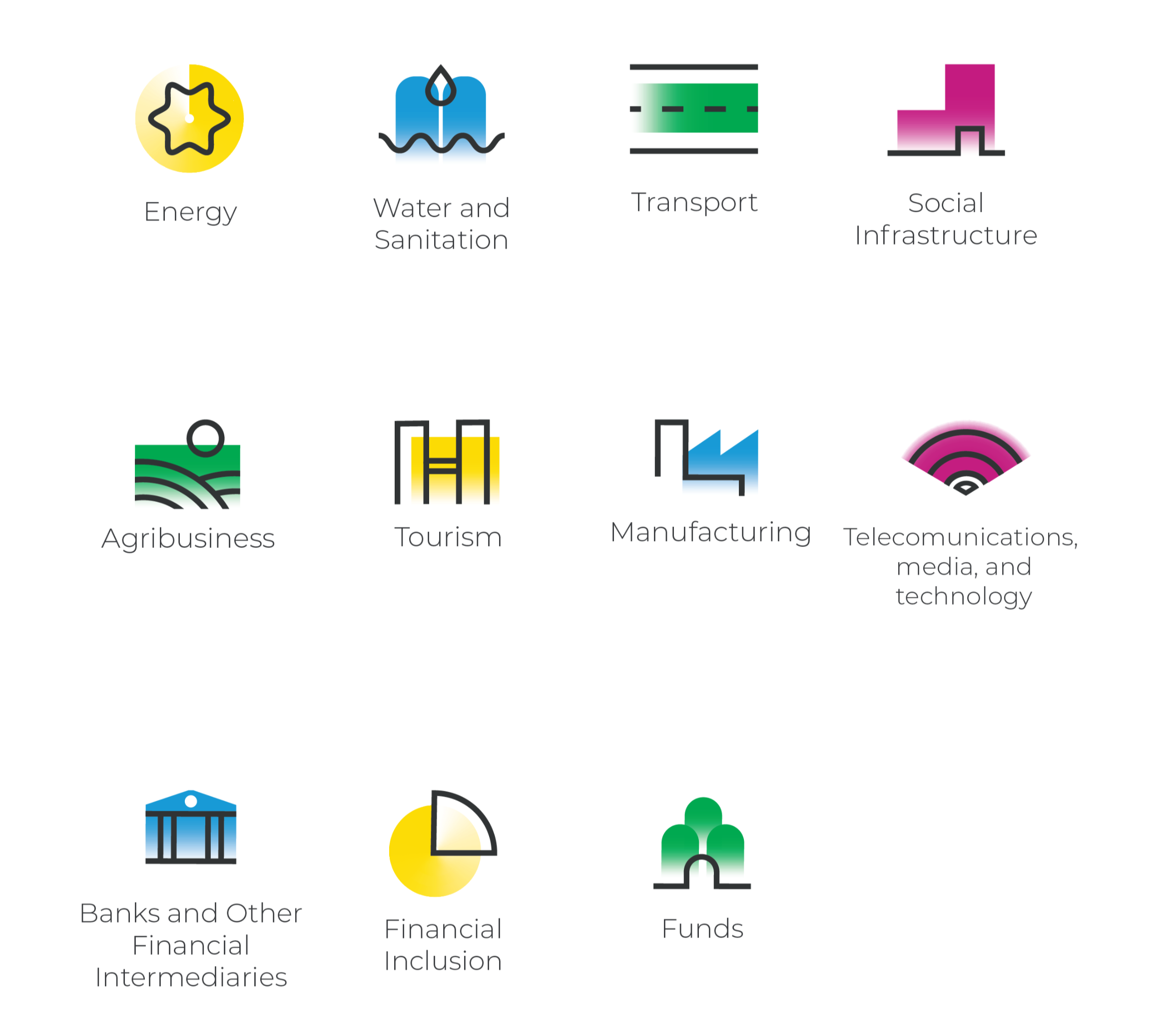
Icons by Sector
Icons by Solution

Icons Gallery
We have created a 120+ icon gallery for use in institutional material, especially in presentations.

Graphics
Photo
Our visual system and our brand design language use photography to convey our brand personality and establish a meaningful emotional connection with our audience.
Each image we select makes an important statement about who we are and the client-centric experiences we deliver.
If you need photos, please find them at www.shutterstock.com and send us the links to brand@idbinvest.org. We will email you the photos within 24 hours.


